Create charts.
Understand your data.
Import a spreadsheet. Build a chart, explore a map, ask AI, and export your work.
Charts, maps, and tables.
Choose a workspace. Find the view that fits your data.
Multi-series trends

Layered comparisons

Regional patterns
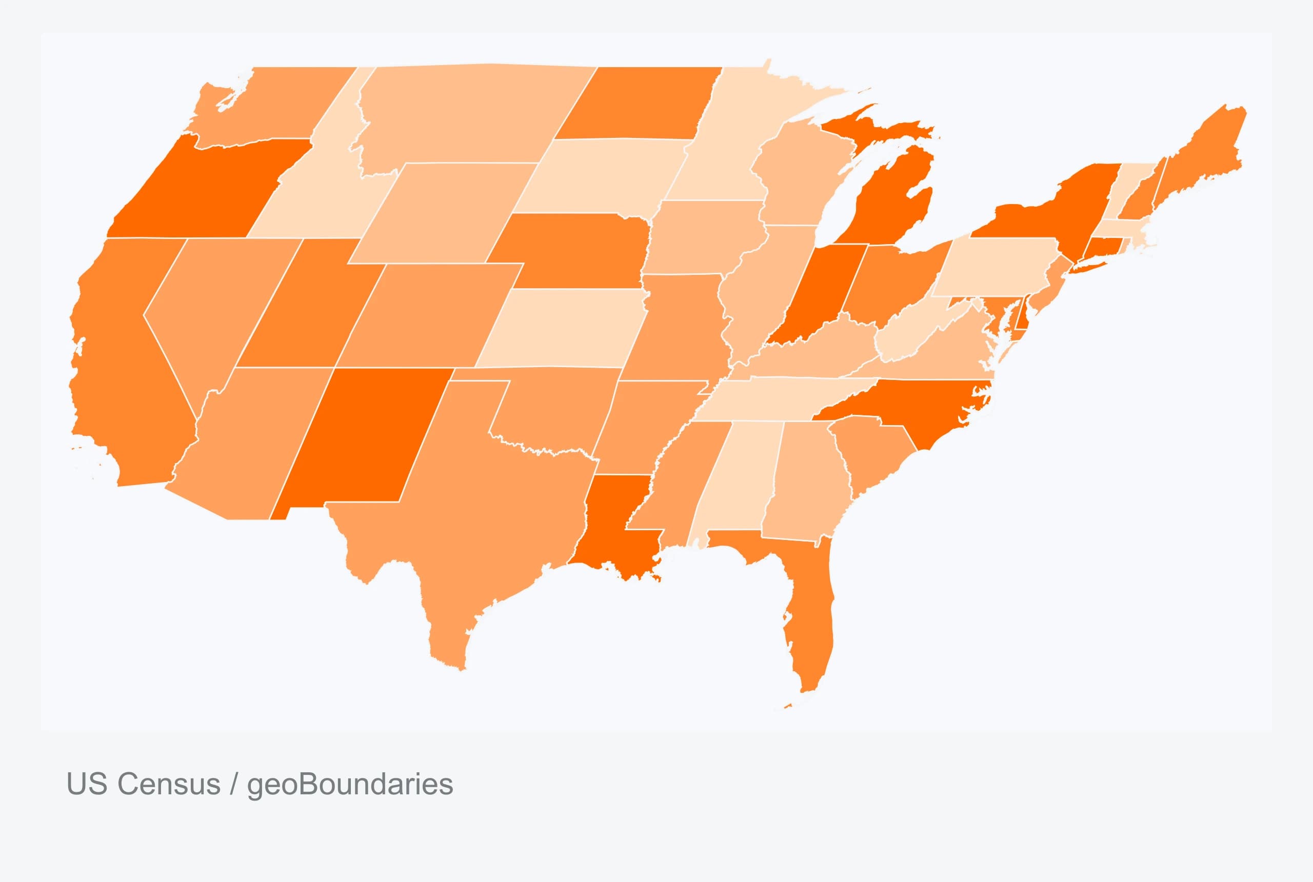
Connected flows

Patterns at a glance

Relationships & scale

Data with context

Two dimensions. One map.
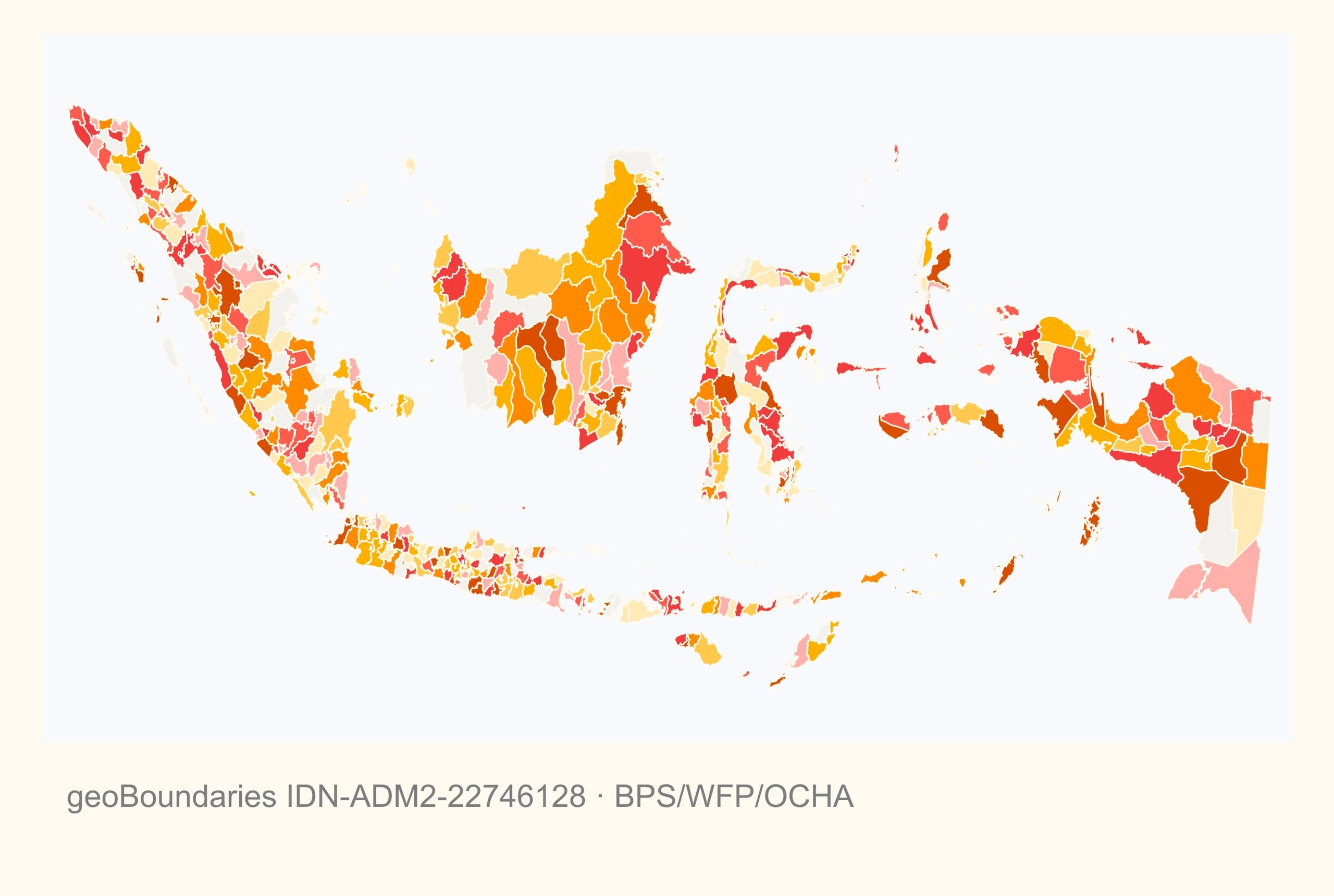
Change over time

Beyond the average

The parts of the whole

Two scales, one view

Change over time
Follow a trend or compare periods.
Comparison
Compare sizes across categories.
Relationships
See how measures move together.
Ranking
Put values in order and spot leaders.
Distribution
Find the spread, clusters and outliers.
Parts & flows
Show composition and movement.
Geography & detail
Explore places and underlying values.
Ask Datamon.
Ask a question. Calculate trends, find relationships, and preview chart changes before applying them.
Calculated from this example.
Inspect the relationship
Dose and yield · illustrative data
Preparing the visualization…
Control every detail.
Fonts, type sizes, colors, markers, annotations, and custom chart dimensions.
Preparing the visualization…
Data. Visualize. Refine. Publish.
Try the workflow here, then continue in the full editor.
Preparing the four-step studio…
Ready for your next report.
Download an image, a vector, or a PDF. Publish an interactive link.


Watch it. Then try it.
Import data, choose a chart, refine the design, and export.
A private product. Your own workspace.
Datamon is not an open-source project.
Browser projects stay on this device. AI and cloud analysis use server services. Publishing shares the chosen data.
Privacy overviewStart with your data.
Build a chart, a map, or a table.